This article assumes that you have RTVS extension added to your VS IDE. You can refer my previous blogs on installation & configuration of RTVS.
- R Support in Visual Studio (RTVS)
- R Programming using RTVS – Part 2
- R Programming using RTVS – Part 3
Prerequisites:
1. Basic knowledge of R programming
2. RTVS Extension
Creating R projects using RTVS
Create a project in visual studio using R template.

Open the Script.R file from solution explorer and type in your R program. In the example below, we create a simple line graph that compares sales and profit performance of a company over a period of 5 years.
#Define Data
sales <- c(2000, 3500, 3000, 4700, 6000)
profit <- c(1450, 2600, 750, 2000, 3750)
#range for axis
rnge <- range(0, sales, profit)
#Plot sales values
plot(sales, type = "o", col = "green", ylim = rnge, axes = FALSE, ann = FALSE)
#draw profit values as line
lines(profit, type = "o", pch = 22, lty = 2, col = "red")
box()
#draw X axis and y axis
axis(1, at = 1:5, lab = c("2013", "2014", "2015", "2016", "2017"))
axis(2, las = 1, at = 1000 * 0:rnge[2])
#Graph Title
title(main = "Sales by Year", col.main = "blue", font.main = 4)
#add axis labels
title(xlab = "Year", col.lab = rgb(0, 0, 1))
title(ylab = "Amount", col.lab = rgb(0, 0, 1))
Place your cursor in the first line of code and use Ctrl+Enter to step through each line to R Interactive and execute. You can see each line execution results to the R Plot window as shown below

Here is the final plot view

Given below is an updated source which generate the output as PDF file
#Define Data
sales <- c(2000, 3500, 3000, 4700, 6000)
profit <- c(1450, 2600, 750, 2000, 3750)

#File name to save output
pdf(file = "sales_and_profit_byYr.pdf", height = 4, width = 5)

#range for axis
rnge <- range(0, sales, profit)

#Plot sales values
plot(sales, type = "o", col = "green", ylim = rnge, axes = FALSE, ann = FALSE)
#draw profit values as line
lines(profit, type = "o", pch = 22, lty = 2, col = "red")
box()

#draw X axis and y axis
axis(1, at = 1:5, lab = c("2013", "2014", "2015", "2016", "2017"))
axis(2, las = 1, at = 1000 * 0:rnge[2])

#Graph Title
title(main = "Sales by Year", col.main = "blue", font.main = 4)

#add axis labels
title(xlab = "Year", col.lab = rgb(0, 0, 1))
title(ylab = "Amount", col.lab = rgb(0, 0, 1))

#Flush the output to PDF file
dev.off()


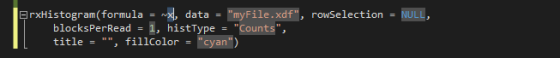
 Type the abbreviated name and use tab to insert a snippet to your code